Family Service of the Piedmont
During 2020, calls to the crisis centers were up.
People lost their jobs,
their mobility away from abusers, and their communities that helped them manage dangerous situations.
Family Service of the Piedmont, a crisis shelter that services both Greensboro and High Point, North Carolina, were awarded a grant by the CARES act to increase visibility and promotion for their services as a way to give those, who may otherwise feel trapped, a tangible way out.
My role.
This project was awarded to me for my perspective and understanding of how to approach the subject matter while maximizing creative content potential within the fixed budget.
I led the core team form concept ideation to final execution and served as a primary client liason.
In our original pitch we used softer, cooler colors to invite a feeling of safety, however through developing client conversations and statistical research, we soon realized that bold, disruptive visuals were necessary for breaking through the noise.
Early storyboard concepts
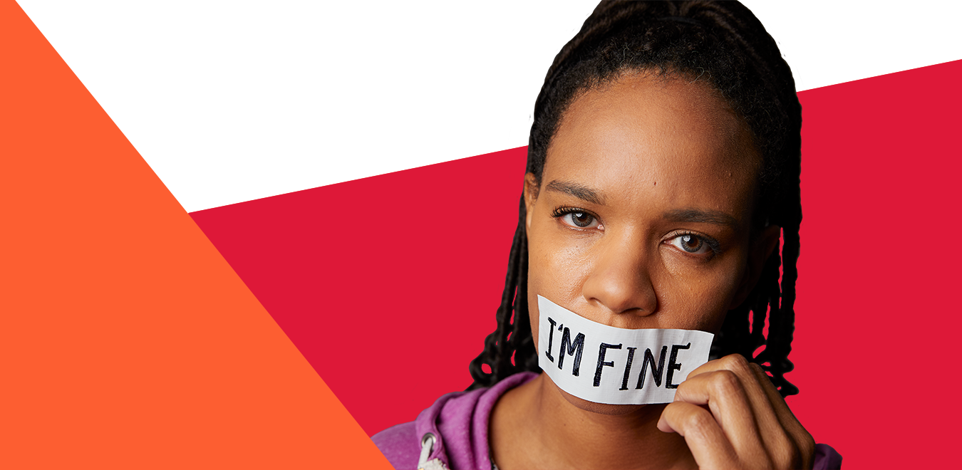
#FineNotFine
Our campaign was derived from a common phrase, turned on its head.
Three models. Three scripts.
Based on researched statistics, we created three separate storylines all meant to break through the stigma of breaking the silence and asking for help.
The Content
The use of diagonal lines are meant to emphasize the radical discomfort of the subjects in our key photography while the copy offers a clear and tangible path to help.
For the billboards, the choice to use red as the primary color was meant to help it cut through the environment and make a stronger impact on the viewer. Against blue skies and green or brown trees, the red, framed by the white negative space, makes an intense visual pop that helps the messaging stand against the natural environment.
The prominent usage of logo was deliberate to specifically help raise awareness for Family Service of the Piedmont, as they are often a backing organization but rarely get direct funding.
Over 60 pieces of unique content were created for this campaign, spanning from Broadcast PSAs in English and Spanish, radio ad spots, billboards, bus ads, and social and web content.
The creative was supported by one day of robust film, photo, and audio booth captures.
The Results?
70% increase in direct traffic, correlated to billboards and bus ads
74% increase in social traffic
30% increase in organic SEO traffic, with the ‘Locations & Services’ page receiving the most visits


